What is quality? Quality (qual·i·ty = degree of excellence), is a word that people use to describe something that is well made, well thought out, and better than most. Many people use quality to describe their services, or products. How does quality relate to web design? Well, not all websites are made equal or with the amount of passion and drive to create something meaningful and useful.
Many people use the word quality when describing their web design services, but how do you know if a website is quality design or not? There are quite a few ways to find quality within web designs, and once you understand what goes into making a quality web design, you can use those techniques to perfect your own web design.
Here are a few pointers to find quality websites, and some good examples of quality websites designs.
1. Correct Spacing
Spacing is the main thing I look for within a good website design – and clever use of spacing with design elements. Pay close attention to how certain things are spaced out and lined up. Spacing can really make the difference of the overall appearance and sense of quality in your design.
The key to getting your spacing right is to look at the big picture of your design, this can really help you get a good idea of how to best space your design elements. Sometimes stepping away or taking a different look at your designs can be a great help. The biggest mistake people make when it comes to spacing is having their content too close to the edges of the layout. No matter how well you designed your site is, if you cram too much content in a small space, it will lose it’s style and quality.
Example of Excellent Spacing
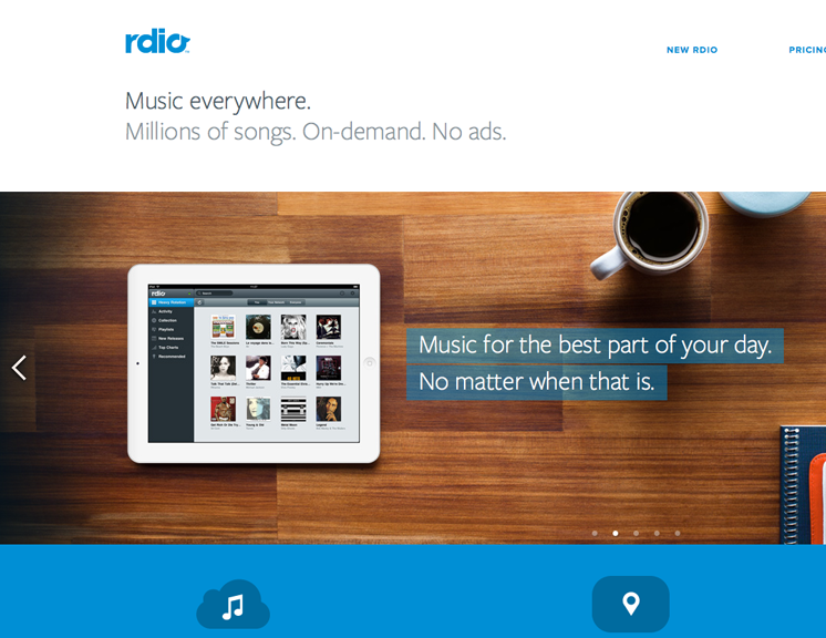
Great Spacing on Rdio.com
If you havn’t seen rdio‘s new design, you need to check it out. As you can see, there is a very clean and open feel to the content on rdio‘s homepage. The designer allowed for a good amount of space around the text, sections, and images.
Tips on Effective Spacing
Deciding on how much space to use is something that will vary from website to website, there is no set amount of space you need. You just need to train your eye to allow for the correct amount of spacing for each element, and use it effectively to fit the design. This only takes practice and experience to pick up.
- Design on a grid system
Using a grid certainly helps you to understand the importance of spacing and keep everything organized and it it’s place. - Practice makes perfect
You can always use a the trial and error method until you find what looks right. - White space is not wasted space
Just because you have an empty area, does not mean you have to fill it. - Less really is more
Rather than trying to see if you can fit more into an area, try to fit less, keep just the vital important information and elements.
2. Pixel Perfect Details
You really can tell when somebody put real time and effort into the finish of a web design. It is the subtle things that really make the difference, and a lot of people might not even notice those fine details. Pixel Perfect quality can be found by paying close attention to lines, edges, and borders.
Rather than having a simple straight line, add small details. Whether it is the use of subtle gradients or something as a simple 1 pixel shadow or highlight, details can really make your work have a sense of quality to it.
Examples of Pixel Perfect details
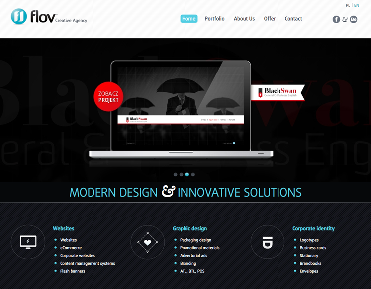
The details on flov’s website
flov has a great understanding of how to make pixels work. You can see how they made the top navigation and mid-section look slicker by adding a subtle texture with eye-catching color and fonts.you can even notice the subtle text behind the header image.
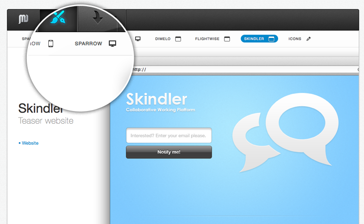
Pixel Perfect Buttons & Separators on Jean – Marc Denise’s portfolio
This beautiful navigation, is a great example of using pixel perfect details to get that feel of quality in your design. The highlighted blue button has a distinct highlight, and the separating lines between the links have the same level of quality and detail, as you can see rather than just having a gray line separation, Jean has included a 1 pixel highlight to the left of it to prevent it looking flat and 2 dimensional.
Quick tips for Perfect Details
Practice really makes perfect here. You don’t need to rely over the top bevels and gradients to give the impression of depth. As you can see, the examples use something as simple as a 1 pixel highlight line to add depth to their designs.
- Subtlness is key
Small details that compliment the content are the key to being subtle. - Think pixels
Borders, gradients, lines and shadows don’t have to be huge to be effective. - Before and after
Compare the results to how they looked before you applied the effects. This will help you see if they were effective or not.
3. Well thought out Typography
Even though the content of a website is not usually written by the designer, the designer plays just as important role in the overall quality of the content. It is the designer’s roll to make sure that the content is displayed in a way that is easy to read and follow through. There are many things you can do to ensure your type is readable and useful.
Here are some examples of how typography really does make a difference.
Examples of Well Thought out Typography
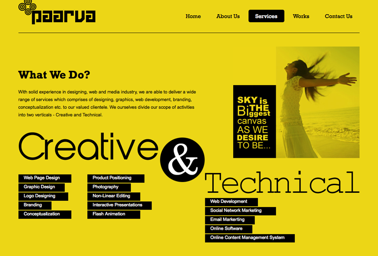
Big & Beautiful on paarva
Titles are important within a web design. A popular trend in web design is to use big or bold fonts for titles. This works in a number of positive ways, not only is it good from a usability point of view, but it helps to create space and define structure within a design. This example from paarva.com is a great example, you can see how the title creates a lot of white space (or yellow, whatever) around it, and is naturally very easy to read.
Leading & Spacing with your Text
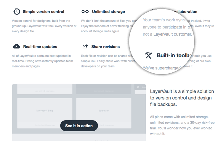
The Layer Vault website really is a beautiful example of how important typography is within web design. The actual typeface itself is very slick, and is a great choice of font. The thing that stands out the most to me, is the attention to detail with the line height (leading), the spacing between each letter (kerning) which has been increased from the default value to create a lot more space and make the text much more readable. A trick which you could try in your next design.
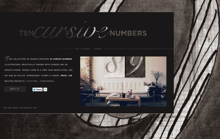
Fonts that fit the mood, 10 Cursive Fonts Website
You can make your choices based upon the different moods certain fonts help bring to a design. The example here has a retro and worn look to it, while still having a very open and modern feel to it, so choosing fonts that help evoke a similar moods to these is essential to it’s success. The modern feel to the website comes from using a very different font to the titles, the main content body is written in a sans-serif typeface with a very open feel to it. The two choices of typeface in this example really help to compliment and set the mood of the design.
Typography tips in Web Design
Spotting good use typography within web design becomes a easier when you’ve seen great examples of typography. But what is it that makes these examples so good, and what should you be looking out for when you design your next website?
- Is it readable?
People don’t like to work, make sure everything is easy to read. Don’t be scared of making your titles big and bold, or using callouts to get the main points across. - Kerning and leading
Spacing between letters and lines can greatly improve your site’s readability. - Do the fonts fit the design?
Obviously you wouldn’t use comic fonts in a law firm’s website. Make sure your fonts fit the mood of the design.
There are probably a thousand more tips out there. If you want to learn more about great use of typography, I suggest looking for more examples of it – online and offline(another post on this later).
4. Organizing Elements
Being a designer appeals to many because of it’s creative nature, and sure it can be a fun and rewarding career. But, how can organizing be creative or fun? Once you get into a habit of good layout organization, you will find that it is not as dull as it sounds. The way you organize design elements in a website are always going to be different. These factors depend on what type of site it is, how important certain features are, and the content of the website.
Although how and where you place things will always vary, there are some things you can do to make organizing your elements and content easier. First, decide on what you want your design to achieve. Are you designing to sell a product? Are you designing for content? Or, are you designing for signups and referrals?
Here are some good example of website designs achieving, things.
Designing to Sell: turningart
Taking a look at turningart’s website, it’s easy to see that it’s no coincidence they are selling their products so well. They’ve made it as easy as possible for you to see what’s for sale and help you to make the final decision to buy. Everything you want from a site designed to sell. Attention is the first thing they’ve done, they get your attention quickly with a summary and big bold titles(steps). Next they generate interest by showing how you can use the product with a lovely illustration. The final feature to keep in mind is action; turningart uses various action points throughout the page Tt is also nice to see that even though the page is quite long, they even have an action point in the footer.

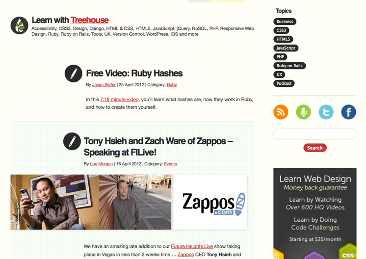
Designing for Content(blogs): Think Vitamin
When you’re designing for a blog, it is a completely different story. You don’t need to convince and re-assure your users about your product. Your “product” is already on display -the content. Make it as easy as possible for your users to see your posts, explore, and connect with your blog.
Content should be the first thing they see on your blog. In this example a nice bold title and icon really draw your eyes straight to the content. A good sized preview image provides good visuals, and date and author information provide experience and a time. For me this is one of the most perfect examples of what I would class as quality “Content Design.” Attention can be directed to anything of interest and the focus is to help the users to stay connected with the content. This will, without a doubt, increase the amount of subscribers and visitors. Encouraging your users to explore your blog is quite simple, you can use anything from tabbed recent or popular content in the sidebar, to drop down menu’s or simple & effective lists. Blogs tend to be very personal things, so allowing your visitors to connect with you in a variety of ways can be a big plus, and can help encourage people to get to know you.
Tips to Help with Organizing your content.
There are times where you will need to break the norm and think differently. Here are some tips to keeping your design well structured and well organized.
- What are you designing for?
As we’ve shown in the above examples, decide what the goal of your design should be. - Designing on a Grid
Grids allow you to keep everything lined up and help you figure out what size certain elements should be. - Testing placement
Be the visitor, would you be able to use it. Is it easy to navigate, or figure out what to do? - Remove unnecessary elements
Anything that is not essential to the goals or design should be removed. - Balance of attention
Some things need to stay simple to allow other elements to be found.
5. Restraint & Subtlety
New designers always seem to look for ways to make an impact with a very unique design or some special effects within a design, but sometimes you can make a bigger impact by restraining yourself. There is a point where something crosses the line from being a good design to being overkill. A good designer can spot when that line has been crossed, and avoids putting too much into a design element or special effect.
“The details are not the details. They make the design.” -Charles Eames
Examples of Web Design using Subtle Effects
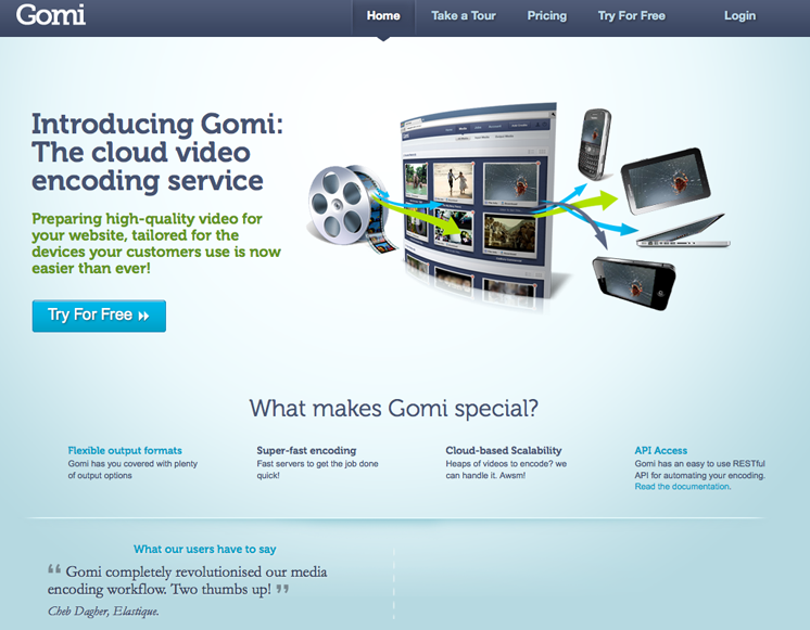
Gradients and more on Gomi
I’m always on the look out for subtle effects on all the websites I visit. Gomi is a fine example full of of subtlety. Pixel highlights, gradients and drop shadows everywhere. Gradients are often over used and really in your face, but used correctly gradients can add a element of reality and depth to a design. Most people might not even spot the gradients, and those for me are the best ones.
Tips for a subtle design
Subtle details can push a design from good, to amazing. If you are looking for a way to inject something special into your designs, try adding subtle detail.
Here are some tips to keep in mind when including subtle details in your design.
- Build layers
Never use one brush or texture and call it done. Build detail by adding more layers of subleness. - Opacity
Even a 3% opacity can have a positive impact. - Colors
Done be afraid to be try colors you think would not “match”, sometimes a color off the palette is what you need to balance a design out.
6. Using color to create quality
The first thing people judge in a design is the color, which is a huge mistake because it should not be based on their personal preferences. If you are ever in a situation where you need to decide which colors should be used in a design, remember they should always be based on the brand and building the mood.
Brilliant use of color In Web Design
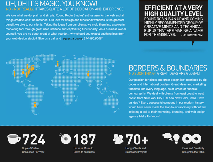
Variety in your Backgrounds: Round Robin Studios
It’s not enough just to have color in your background and expect that to make it interesting. Some of the best backgrounds are those that have a bit of variety, in this example we see that the beautiful blue and grey colors are subject to all sorts of lighting effects and gradients. It gives an extra something to the background, and prevents it from looking stale and flat. Important to note here too that the contrast between the dark & deep orange works really nice set behind the much lighter content area.
Tips for using color in design
Color is always a good area for exploration and trying different possibilities and variations, but it’s always important to keep a few things in mind when choosing colors and a color scheme.
- Experiment
A boring topic does not always mean a boring color scheme. Get creative, and experiment with different colors. - Variety
Try using gradients, patterns, brushes on backgrounds. Color alone doesn’t always make something look good. - Stick to a color palette – most of the time
Make sure your colors are relevant to your product or service.
7. Build to fit
One of the newer techniques in web design is building sites to be responsive, or fitting the screen of multiple devices. If you take the time to build a site that fits everything you can imagine, that is quality. Building a responsive website is no easy task. Every design element is taken into consideration.
Examples of responsive websites
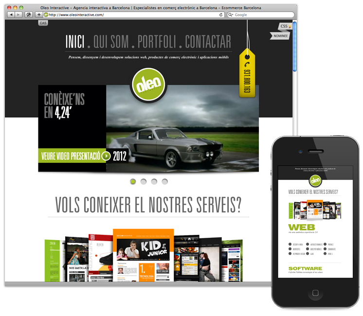
Oleo Interactive
Oleo Interactive is an great example of a quality responsive website. Move the browser window around and see what I mean. Check out our post for more examples of responsive websites.
Tips for building a responsive website
Obviously the above examples are not meant to be “inspiration” for unique ideas, just simply a couple of sites that I find unique.
- Define the break points
Before doing anything, figure out where your breakpoints are going to be. A typical responsive design tends to have 3-4 break points that cover a small range of viewport dimensions. - Get started!
With your break points defined, now you can begin to consider the design layout. If you haven’t already, familiarize yourself with what other people are doing (what layouts work), and check out the above examples. Read out post to help your get started with responsive web design. - Get it in the browser
As soon as you can, start building a prototype of your sketches/wireframes. You do not have to wait until the design is completely finished to begin building the website. Many people start here before opening Photoshop, and add design elements later on.
8. Doing something nobody else has done
Some of the best websites around are designed by those that thought out of the box, and those that challenge the norm can end up changing what the norm is. No matter what we do, try to be original and think differently in your design. But, keep in mind there are reasons some thing have never been done, and it’s usually because it does not work.
Examples of those that challenged the norm
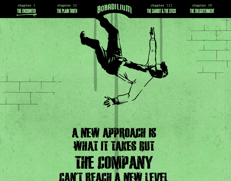
Bobadilium and their story-line
Bobadilium have one goal in mind, getting their message across. So they’ve got very little text, they have a unique story-line explaining how they work and what they can do for you. This is much more appealing then just having a list of services.
ConvergeSE’s animations
ConvergeSE’s site shows us howto draw in the use and create a really impressive site. You are greeted with a dinosaur whose skin and weapons come off as you scroll the page. There’s no mass of text or fancy words to convince you that you need to go to this workshop, it sort of speaks for itself. I love how this site works.

Tips for trying something new
Obviously the above examples are not meant to be “inspiration” for unique ideas, just simply a couple of sites that I find unique.
- Keep it Relevant
If you’re going to do something very new and unique, ask yourself “does it make sense” and “does it fit with the branding?” if so then go do it! - Ignore everything you know!
Okay maybe not everything, basic principles may stay the same, but there’s no point looking for inspiration on new ideas, you’ll just be heading in the wrong direction. - Keep a level of quality
I think generally if your new idea looks good, and works well it’s much easier for you to justify.
What Do you look for in a Quality Design? There are so many things that can make a design stand out as quality, we only covered a few of the basic points, so we would love to hear your ideas on finding quality within web design.
Really great tips and examples, thanks a lot for the sahre, keep it up!
Thanks for putting our website as an exemple for this great article. Grzegorz from FLOV.
You’re welcome 🙂
Wow, fabulous blog and fantastic article, thanks for sharing with us!
Awesome tips, i really like it.
This is a nice blog i like to see that! thanks fro shearing!
Building a professional quality based website is one of the best opportunities your website author can take to expand your client base. These tips help you understand what it takes to make your new website successful at generating traffic and leads.Thanks
Cool! Thanks for this! 🙂